Project structure
To add an app card to an app, create acards directory within src/app. The cards directory should contain:
- A JSON configuration file for each card that defines the card’s schema (
*-hsmeta.json). - A React file for each card that renders the card’s front-end (
.jsxor.tsx). - A
package.jsonfile to handle any needed dependencies. This file is shared between all app cards.
App card configuration
In the*-hsmeta.json configuration file for your app card, include the properties below.
Fields marked with * are required.
| Field | Type | Description |
|---|---|---|
uid* | String | The card’s unique identifier. This can be any string, but should meaningfully identify the card. HubSpot will identify the card by this ID so that you can change the card’s title without removing historical or stateful data, such as the position on the CRM record. |
type | String | The type of component, which should be card in this case. |
config | Object | An object containing configuration details. |
name* | String | The card’s title, as displayed in HubSpot’s UI. |
description | String | A description of the card. |
previewImage | Object | An object containing the file and altText fields. The file field is the relative path to the preview image. Valid file extensions are png, jpeg, jpg, or gif. The maximum file size is 5.0 MB. The altText field is a short description of the image. |
entrypoint* | String | The file path of the card’s front-end React code. |
location* | crm.record.tab | crm.record.sidebar | crm.preview |helpdesk.sidebar | Where the card appears in HubSpot’s UI. You can only specify one location value, but some location and objectTypes combinations result in multiple location support. See the Supported locations section below for more details. |
objectTypes* | Array | The types of CRM records that the card will appear on. See the Supported objects section below for more details. |
Supported objects
In theobjectTypes array of the card’s *-hsmeta.json configuration file, specify the types of CRM records that the card will appear on. Below are the currently supported CRM objects, their objectType value, and the minimum scope to add to your app.
For HubSpot’s standard objects,
objectType values are not case sensitive, and both the singular and plural are supported. For example, "CONTACT" and "contacts" are both valid.| CRM object | objectType value | Related scope |
|---|---|---|
| Contacts | CONTACT | crm.objects.contacts.read |
| Companies | COMPANY | crm.objects.companies.read |
| Deals | DEALS | crm.objects.deals.read |
| Tickets | TICKETS | tickets |
| Orders | ORDERS | crm.objects.orders.read |
| Carts | CARTS | crm.objects.carts.read |
| Custom objects | p_objectName (case sensitive) | crm.objects.custom.read |
| App objects | app_object_uid | See app objects scopes |
The custom object wildcard
p_* can be used in lieu of p_objectName to target all custom objects in the HubSpot account.| CRM object | objectType value | Related scopes |
|---|---|---|
| Appointments | APPOINTMENTS | crm.objects.appointments.read |
| Courses | COURSES | crm.objects.courses.read |
| Listings | LISTINGS | crm.objects.listings.read |
| Services | SERVICES | crm.objects.services.read |
| Projects | PROJECTS | crm.objects.projects.read |
Supported locations
In thelocation field of the card’s *-hsmeta.json configuration file, specify where the card should display in HubSpot. Below are the currently supported locations.
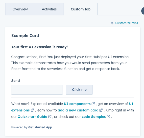
crm.record.tab: places the extension in the middle column of CRM record pages, either in one of HubSpot’s default tabs or in a custom tab. WhenobjectTypeis set toCOMPANIES, the card will also be available in the sales workspace target accounts preview panel.
Show screenshot
Show screenshot
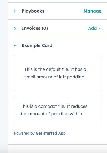
crm.record.sidebar: displays the extension in the right sidebar of CRM record pages. Extensions in the sidebar cannot use CRM data components. WhenobjectTypeis set toDEALS, the card will also be available in the sales workspace deals sidebar.
Show screenshot
Show screenshot
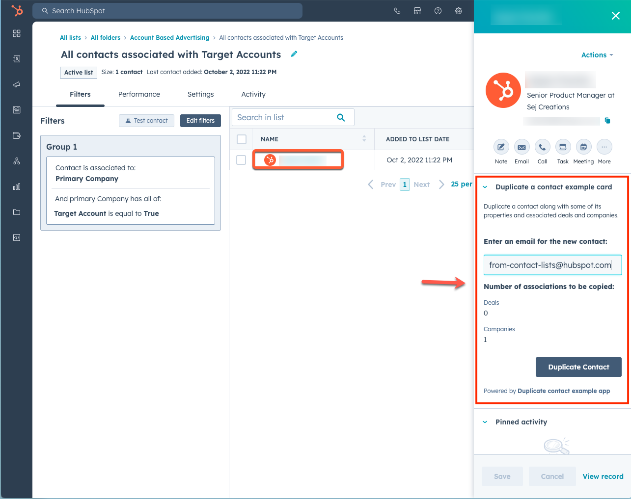
crm.preview: displays the app card in the preview panel that you can access throughout the CRM. When using this location, the extension will be available when previewing theobjectTypesspecified in the JSON config file. This includes previewing records from within CRM record pages, index pages, board views, and the lists tool. Learn more about customizing previews.
Show screenshot
Show screenshot
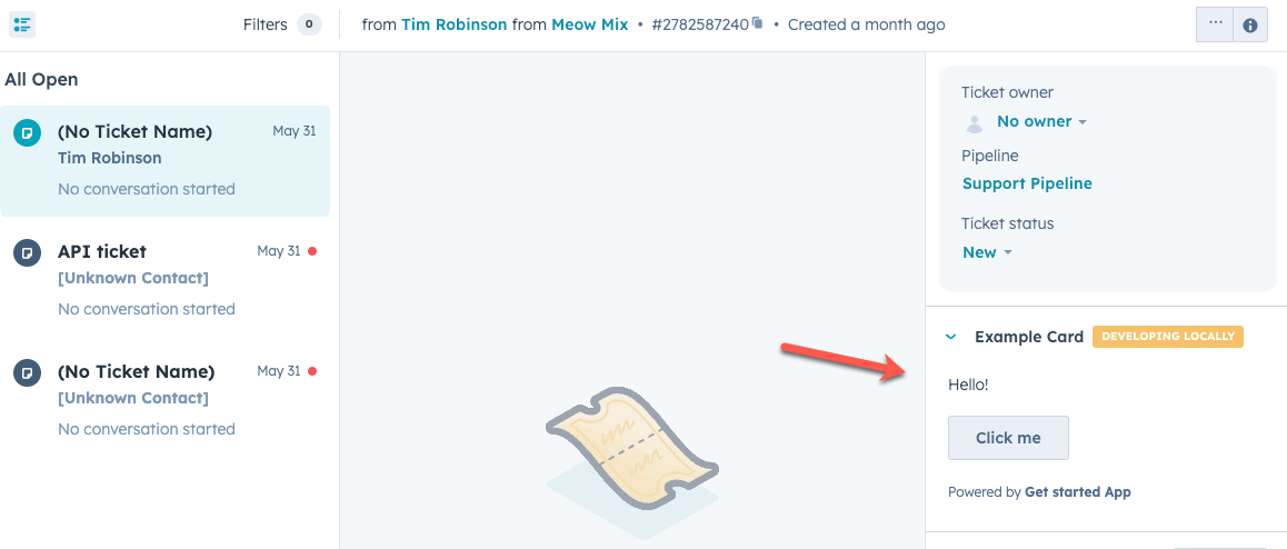
helpdesk.sidebar: displays the card in the ticket sidebars within help desk. This includes both the ticket preview panel on the help desk home page and the right sidebar of the ticket view in help desk. To add a card to this location, you’ll need to configure your help desk settings to include the card.
Show screenshots
Show screenshots
- Help desk home:
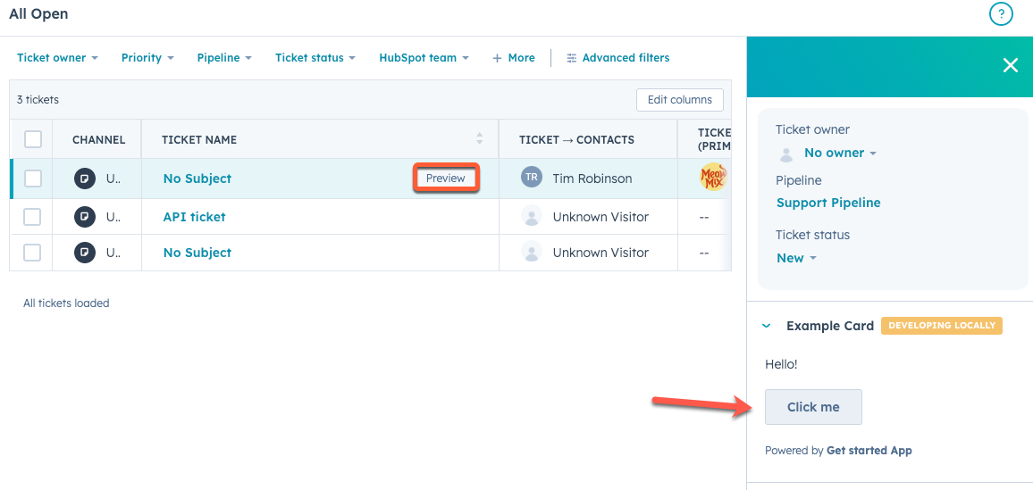
- Help desk ticket view:
Building the React front-end
The UI of an app card is created by a React component file, either.jsx or .tsx. This file lives in the cards/ directory alongside the the card configuration JSON file (*-hsmeta.json). In the card configuration file, you’ll specify the path of the React file in the entrypoint field.
Below is an example of a simple app card, which includes Text and Button UI components to render the card content, along with a Flex component for managing layout.
Managing dependencies
You can include dependencies for your app card in apackage.json file within the cards/ directory. By default, when adding an app card through the hs project add command, a package.json file will be created for you with the following dependencies:
@hubspot/ui-extensionsreacttypescript
package.json file, you can run the hs project install-deps command in your project directory.