The Button component renders a single button. Use this component to enable users to perform actions, such as submitting a form, sending data to an external system, or deleting data. Button text is passed into the component like a standard HTML element, rather than through a prop.
Below, learn how to implement buttons in a UI extension. For guidance on button design, check out the Button design patterns.
- Button text: the visible button text that describes the button’s action.
- Variant: the color of the button. Learn more about available button variants below.
import { Button } from "@hubspot/ui-extensions";

const Extension = () => {
  return (
    <Button
      onClick={() => {
        console.log("Someone clicked the button!");
      }}
      href={{
        url: "https://wikipedia.org",
        external: true,
      }}
      variant="primary"
      size="md"
      type="button"
    >
      Click me!
    </Button>
  );
};
Props
| Prop | Type | Description |
|---|
disabled | Boolean | When set to true, the button will render in a greyed-out state and cannot be clicked. |
href | Object | Include this prop to open a URL on click. Contains the following fields:url (string): the URL that will open on click.external (boolean): set to true to open the URL in a new tab and display an external link icon. By default:- Links to HubSpot app pages will open in the same tab and will not include an icon.
- Links to non-HubSpot app pages will open in a new tab and include the icon.
When a button includes both href and an onClick action, both will be executed on button click. |
onClick | () => void | A function that will be invoked when the button is clicked. It receives no arguments and it’s return value is ignored. |
overlay | Object | Include a Modal or Panel component in this object to open it as an overlay on click. Learn more about using overlays. |
size | 'xs', 'extra-small' | 'sm', 'small' | 'med', 'medium' (default) | The size of the button. |
truncate | Boolean | When set to true, long button text will be truncated with an ellipsis (...), with the full text displayed in a tooltip on hover. |
type | 'button' (default) | 'reset' | 'submit' | Sets the role HTML attribute of the button. |
variant | 'primary' | 'secondary' (default) | 'destructive' | 'transparent' | Sets the color of the button. See variants section for more information. |
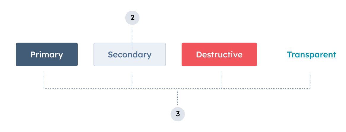
Variants
Using the variant prop, you can set the color of the button.
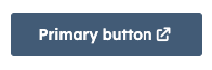
'primary': a dark blue button for the most frequently used or most important action on an extension. Each extension should only have one primary button.
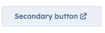
'secondary': a grey button to provide alternative or non-primary actions. Each extension should include no more than two secondary buttons.
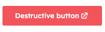
'destructive': a red button for actions that delete, disconnect, or perform any action that the user can’t undo. Button text should clearly communicate what is being deleted or disconnected. After a destructive button is clicked, the user should have to verify or confirm the action.
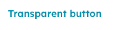
'transparent': a button with the background and border color removed, styled like a hyperlink.
Please note:HubSpot does not provide variant options for the orange buttons you’ll find across the app (both solid and outlined). Those color variants are reserved for the HubSpot product, which helps to maintain the hierarchy of available actions on a given page.
Usage examples
- Use a
'primary' button at the end of a form to submit data to another system.
- Use a
'secondary' button next to a primary form submit button to reset form fields.
- Use a
'destructive' button to enable users to delete a contact’s data from an external system.
- Set a button to
'disabled' when a contact doesn’t qualify for a form submission due to missing criteria or other ineligibility.
Guidelines
- DO: set button text that clearly communicates what action will occur when a user clicks it. Text should be unambiguous and concise (~2-4 words).
- DO: use sentence-casing for button text (only the first word capitalized).
- DO: minimize the number of buttons that appear on a page record across all extensions.
- DO: always open links to pages outside of the HubSpot app in a new tab (
external: true).
- DON’T: include multiple primary buttons in a single extension.
- DON’T: use a destructive button unless the consequences are significant or irreversible.