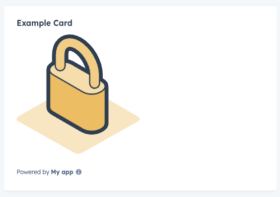
The Illustration component renders an illustration from HubSpot’s illustration library. Use this component to add a visual indicator to your app card.
import { Illustration } from "@hubspot/ui-extensions";

const Extension = () => {
  return (
    <Illustration
      name="lock"
      alt="Lock icon indicating content is currently restricted or inaccessible"
      width={300}
      height={300}
    />
  );
};
Props
| Prop | Type | Description |
|---|
alt | String | The illustration’s alt text for accessibility. Default value is <name> illustration. |
height | Number | The height of the illustration in pixels. |
name | String | The name of the illustration. See available illustrations. |
width | Number | The width of the illustration in pixels. |
Available illustrations

electronicSignatureEmptyState

successfullyConnectedEmail
Last modified on January 9, 2026