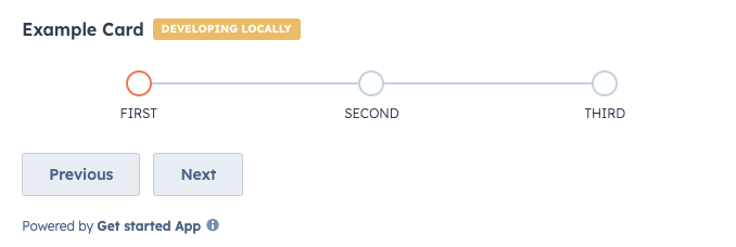
The StepIndicator component renders an indicator to show the current step of a multi-step process.
import { Flex, Box, StepIndicator, Button } from "@hubspot/ui-extensions";

hubspot.extend(() => <Extension />);

function Extension() {
  const [currentStep, setCurrentStep] = useState(0);

  return (
    <Flex direction="column" gap="md">
      <StepIndicator currentStep={currentStep} stepNames={["First", "Second", "Third"]} />
      <Box>
        <Button onClick={() => setCurrentStep(currentStep - 1)}>Previous</Button>
        <Button onClick={() => setCurrentStep(currentStep + 1)}>Next</Button>
      </Box>
    </Flex>
  );
}
Props
| Prop | Type | Description |
|---|
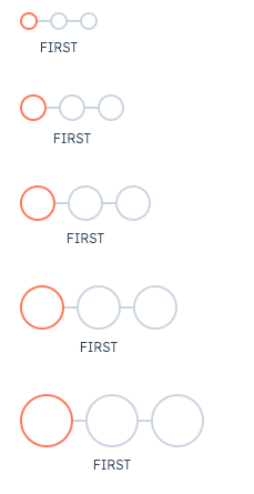
circleSize | 'xs', 'extra-small', | 'sm', 'small' (default) | 'md', 'medium' | 'lg', 'large' | 'xl', 'extra-large' | The size of the indicator circles. See the variants section for examples of sizing. |
currentStep | Number | The currently active step. Steps are zero-based, meaning the first step is assigned 0. |
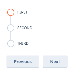
direction | 'horizontal' (default) | 'vertical' | The orientation of the indicator. |
stepNames | Array | An array containing the name of each step. |
variant | 'flush' | 'default' (default) | 'compact' | Sets component spacing.compact: only shows the title of the currently active step.flush: only shows the title of the currently active step and removes left and right margin.
|
onClick | (stepIndex: number) => void | A function that is invoked when a step in the indicator is clicked. The function receives the current step index as an argument (zero-based). Use this to update the currently active step. |
Variants
By default, the step indicator will be laid out horizontally, but you can use the direction prop to set the orientation to vertical instead.
In addition, you can set the size of the step circles using the circleSize prop, ranging from 'xs'/'extra-small' to 'xl'/'extra-large'.
Last modified on December 10, 2025