The StepperInput component renders a number input field that can be increased or decreased by a set number.
This component inherits many of its props from the NumberInput component, with an additional set of props to control the increase/decrease interval.
import { StepperInput } from "@hubspot/ui-extensions";
return (
<StepperInput
min={5}
max={20}
minValueReachedTooltip="You need to eat at least 5 cookies."
maxValueReachedTooltip="More than 20 cookies is a bit much."
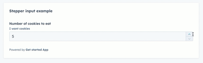
label="Number of cookies to eat"
name="cookiesField"
description={"I want cookies"}
value={cookies}
stepSize={5}
onChange={value => {
setCookieCount(value);
}}
/>
);
Props
| Prop | Type | Description |
|---|
defaultValue | String | The default input value. |
description | String | Text that describes the field’s purpose. |
error | Boolean | When set to true, validationMessage is displayed as an error message if provided. The input will also render its error state to let the user know there’s an error. If left false (default), validationMessage is displayed as a success message. |
formatStyle | 'decimal' (default) | 'percentage' | Formats the number as a decimal or percentage. |
label | String | The text that displays above the input. |
max | Number | The highest number allowed in the input. |
maxValueReachedTooltip | String | Text that will appear in a tooltip when the user has reached the maximum value. |
min | Number | The lowest number allowed in the input. |
minValueReachedTooltip | String | Text that will appear in a tooltip when the user has reached the minimum value. |
name | String | The input’s unique identifier. |
onBlur | (value: number) => void | A function that is called and passes the value when the field loses focus. |
onChange | (value: number) => void | A callback function that is called with the new value or values when the list is updated. |
onFocus | (value: number) => void | A function that is called and passed the value when the field gets focused. |
placeholder | String | Text that appears in the input when no value is set. |
precision | Number | The number of digits to the right of the decimal point. |
readOnly | Boolean | When set to true, the checkbox cannot be selected. Default is false. |
required | Boolean | When set to true, displays a required field indicator. Default is false. |
stepSize | Number | The amount that the current value will increase or decrease by. Default is 1. |
tooltip | String | The text that displays in a tooltip next to the label. |
validationMessage | String | The text to display if the input has an error. |
value | String | The value of the input. |
Last modified on January 9, 2026