The Tabs component allows you to group related content into clickable tabs, with each Tab child component creating a new tab. Options are provided for visual variants, tooltip configuration, and more.
import { Alert, Tabs, Tab } from "@hubspot/ui-extensions";
// `defaultSelected` sets the initial tab,
// user controls changing tabs via clicking
const Extension = () => {
return (
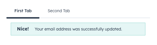
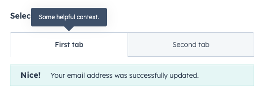
<Tabs defaultSelected="first">
<Tab tabId="first" title="First Tab">
<Alert variant="success" title="Nice!">
Your email address was successfully updated.
</Alert>
</Tab>
<Tab tabId="second" title="Second Tab">
Tab 2's content
</Tab>
</Tabs>
);
};
Props
<Tabs> props
| Prop | Type | Description |
|---|
defaultSelected | String | Number | The ID of the tab to display by default (as set by the Tab’s tabId prop). |
fill | Boolean | Whether the tabs should fill the available space. |
onSelectedChange | (selectedId: string | number) => void | A function that gets invoked when the selected tab changes. |
selected | String | Number | The currently selected tab ID, for controlling the component via React state. |
variant | default | enclosed | Visual style of the tabs. See variants for more information. |
<Tab> props
| Prop | Type | Description |
|---|
disabled | Boolean | Whether the tab should be disabled. When set to false, tab will be greyed out and not clickable. |
tabId | String | Number | The tab’s unique identifier. |
title | String | The tab’s title text. |
tooltip | String | The text that appears in a tooltip on hover. Learn more about tooltips. |
tooltipPlacement | top (default) | bottom | left | right | | Where the tooltip should appear, relative to the tab. |
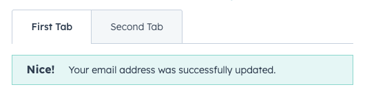
Variants
The variant prop provides two options for tab styling: default and enclosed.
<Tabs
  variant="default"
  defaultSelected="first"
>
  <Tab tabId="first" title="First Tab">
    <Alert variant="success" title="Nice!">
      Your email address was successfully updated.
    </Alert>
  </Tab>
  <Tab tabId="second" title="Second Tab">
    Tab 2's content
  </Tab>
</Tabs>
<Tabs
  variant="enclosed"
  defaultSelected="first"
>
  <Tab tabId="first" title="First Tab">
    <Alert variant="success" title="Nice!">
      Your email address was successfully updated.
    </Alert>
  </Tab>
  <Tab tabId="second" title="Second Tab">
    Tab 2's content
  </Tab>
</Tabs>
fill prop to true to configure the tabs to take up the full width of the container.
<Tabs
  variant="enclosed"
  fill={true}
  defaultSelected="first"
>
  <Tab tabId="first" title="First Tab">
    <Alert variant="success" title="Nice!">
      Your email address was successfully updated.
    </Alert>
  </Tab>
  <Tab tabId="second" title="Second Tab">
    Tab 2's content
  </Tab>
</Tabs>
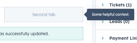
tooltip prop to add tooltips to tabs on hover. By default, the tooltip will appear above the tab, but you can use the tooltipPlacement prop to configure it further.
<Tabs variant="enclosed" defaultSelected="first">
  <Tab
    tooltip="Some helpful context."
    tabId="first"
    title="First Tab"
  >
    <Alert variant="success" title="Nice!">
      Your email address was successfully updated.
    </Alert>
  </Tab>
  <Tab tabId="second" title="Second Tab">
    Tab 2's content
  </Tab>
</Tabs>
<Tabs variant="enclosed" defaultSelected="first">
<Tab
tooltip="Some helpful context."
tooltipPlacement="right"
tabId="first"
title="First Tab"
>
<Alert variant="success" title="Nice!">
Your email address was successfully updated.
</Alert>
</Tab>
<Tab tabId="second" title="Second Tab">
Tab 2's content
</Tab>
</Tabs>
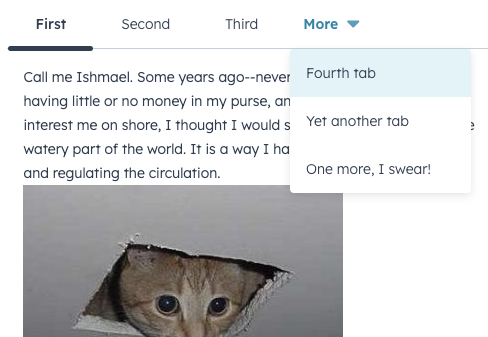
<Tab tooltip="Some helpful context." tooltipPlacement="right" tabId="second" title="Second tab">
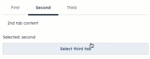
Controlling tabs via React state
In addition to being able to switch tabs by clicking on each tab, you can also control tab select via React state using the selected and onSelectedChange props.
import React, { useState } from "react";
import { Tabs, Tab, Button, Text } from "@hubspot/ui-extensions";

// Uses `selected` and `onSelectedChange` props to handle updates

const BasicExtension = () => {
  const [selected, setSelected] = useState("second");
  return (
    <>
      <Tabs selected={selected} onSelectedChange={setSelected}>
        <Tab tabId="first" title="First">
          1st tab content
        </Tab>
        <Tab title="Second">2nd tab content</Tab>
        <Tab title="Third">3rd tab content</Tab>
      </Tabs>
      <Text>Selected: {selected}</Text>
      <Button onClick={() => setSelected("third")}>Select third tab</Button>
    </>
  );
};
Last modified on January 28, 2026