Prerequisites
Before getting started, ensure that you’ve installed the latest version of the HubSpot CLI, and you’ve followed the creation guide here,Set up extension files
Within your project’s app directory, create an/extensions directory with the following files:
example-card.json: the card configuration.Example.jsx: the React file that serves as the front-end.package.json:metadata about the extension’s front-end. This file is required and can be used to include dependencies for your React front-end.
extensions directory, you’ll also need to install the HubSpot UI extensions npm package by running npm i @hubspot/ui-extensions.
example-card.json
The configuration file for the UI extension’s app card.Extension location
You can configure which part of the HubSpot UI to customize using thelocation property in the extension’s JSON config file. While you can only specify one location, some location and objectTypes combinations result in multiple location support, as noted below. The follow locations are available:
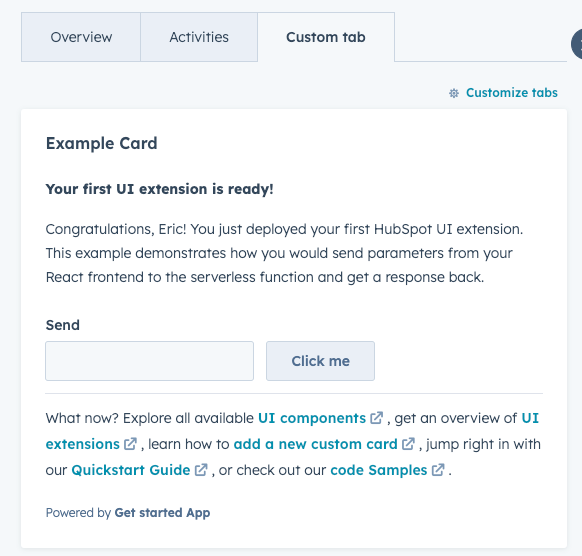
crm.record.tab: places the extension in the middle column of CRM record pages, either in one of HubSpot’s default tabs or in a custom tab. WhenobjectTypeis set tocompany, the card will also be available in the sales workspace target accounts preview panel.
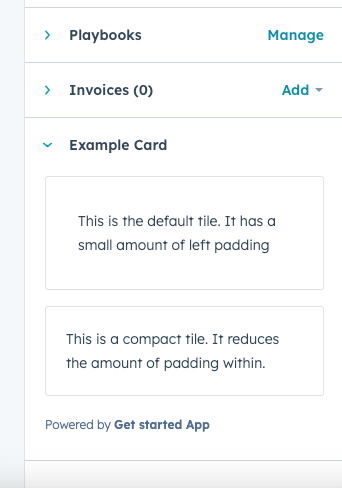
crm.record.sidebar: displays the extension in the right sidebar of CRM record pages. Extensions in the sidebar cannot use CRM data components. WhenobjectTypeis set todeals, the card will also be available in the sales workspace deals sidebar.
-
crm.preview: displays the app card in the preview panel that you can access throughout the CRM. When using this location, the extension will be available when previewing theobjectTypesspecified in the JSON config file. This includes previewing records from within CRM record pages, index pages, board views, and the lists tool. Learn more about customizing previews.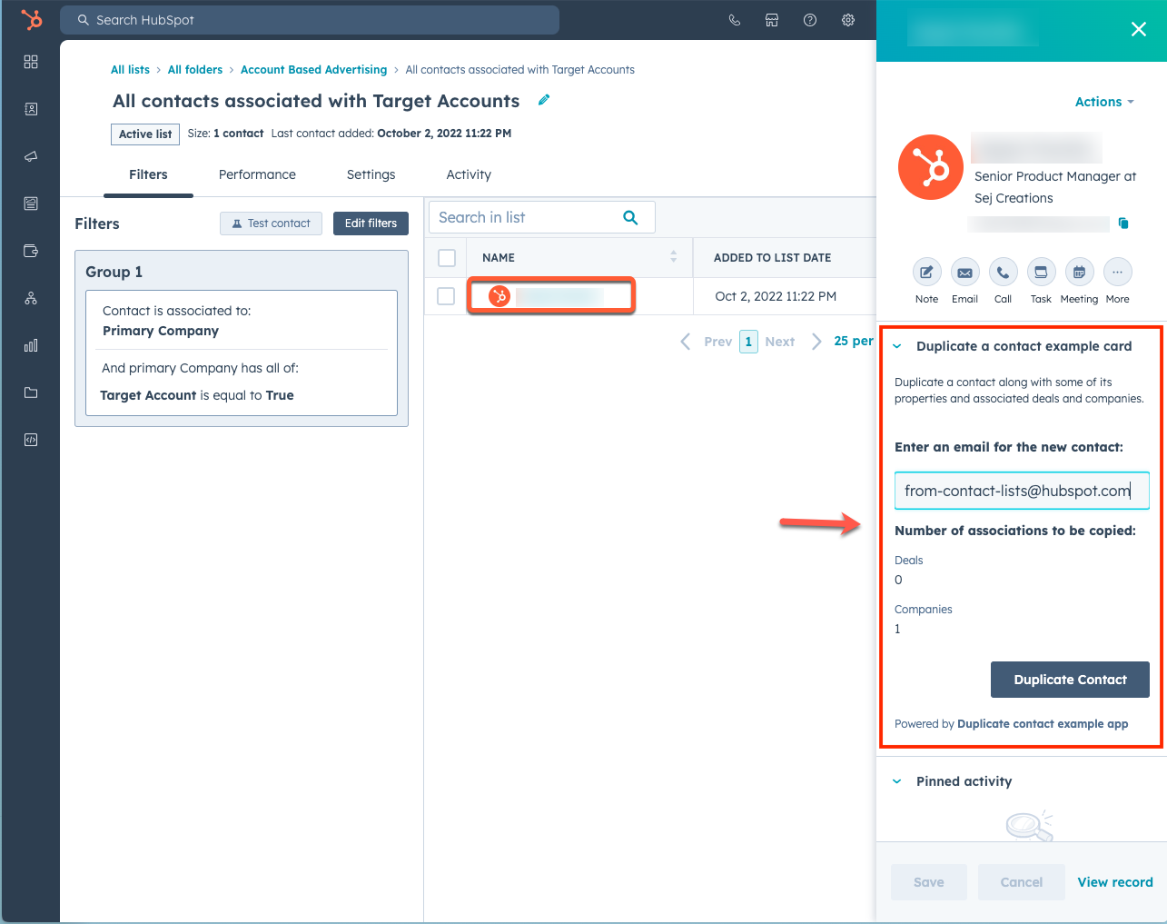
-
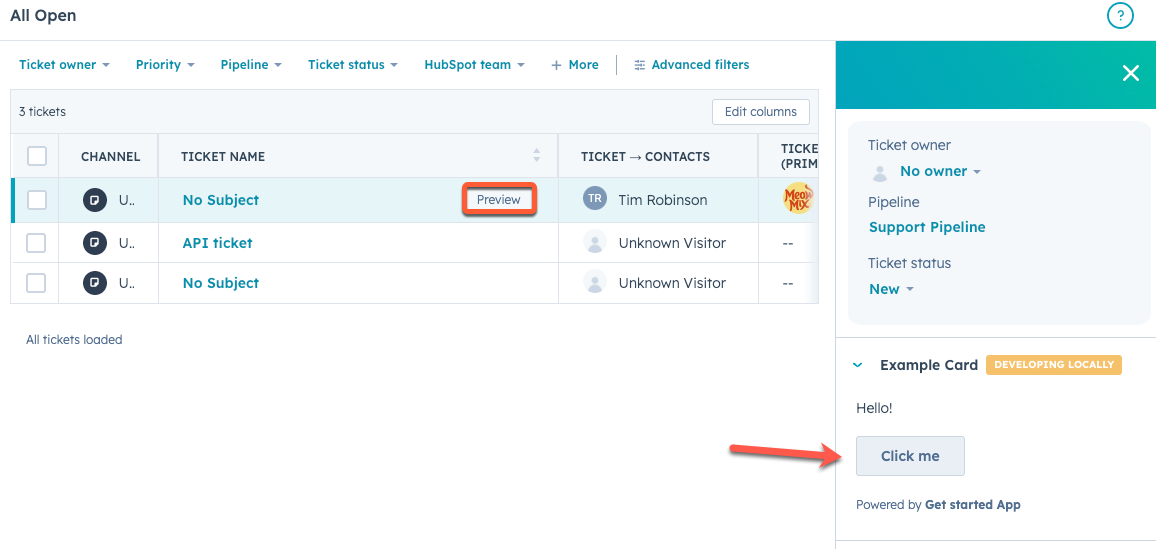
helpdesk.sidebar: displays the card in the ticket sidebars within help desk. This includes both the ticket preview panel on the help desk home page and the right sidebar of the ticket view in help desk. To add a card to this location, you’ll need to configure your help desk settings to include the card.
 Help desk ticket view:
Supported objects
You can create extensions for both standard object and custom object records. In the app card’s JSON configuration file, you’ll define this within theobjectTypes array.
When building an extension for custom objects, you’ll reference the object as p_objectName (case sensitive). To get this value, make a GET request to the custom object schema API, then look for the fullyQualifiedName in the response. Take the fullyQualifiedName, then remove the HubID number, and use the resulting value for the configuration file.
fullyQualifiedName of p123456_Cats, the correct value to use for the configuration file would be p_Cats.
The custom object wildcard
p_* can be used in lieu of p_objectName to target all custom objects in the HubSpot account.Example.jsx
The React front-end file, which includes a call to a serverless function.package.json
Metadata about the extension’s front-end. This file is required and can be used to include dependencies for your React front-end.Start local development
With your project files created locally, you can now runhs project dev to upload the files to HubSpot, then run hs project dev to start a local development server. start a local development server to view the extension in HubSpot. The local development server will pick up changes saved to your React files without needing to refresh the page or re-upload the project.
Learn more about using project CLI commands.
Adding cards to the UI
To view an app card in HubSpot, you’ll need to add it to the UI in its specified location. For example, to add a card to the contact record view:- Log in to your HubSpot account.
- In your HubSpot account, navigate to Contacts > Contacts. Then, click the name of a contact to view its record.
-
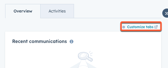
At the top of the contact record, click Customize tabs. A new tab will open showing the record editor sidebar.
- In the right sidebar, click Default view to edit the default contact record view.
-
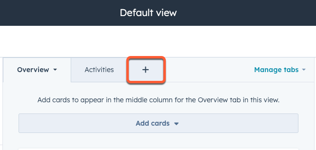
For the purposes of this tutorial, click the + plus icon tab at the top of the editor to add a new tab.
- In the dialog box, enter a name for your new tab, then click Done.
- With the new tab added, click the Add cards dropdown menu.
-
In the right panel, under Card types, click Apps.

- Select the checkbox next to the example extension that’s part of your public app.
- Click the X at the top of the right panel to close it.
- In the top right, click Save and exit.
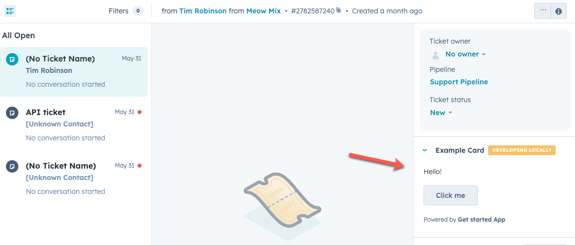
- Navigate back to the contact record, then refresh the page. You should now see your new tab, which will contain your new card. With the local development server running, you’ll see a Developing locally tag displayed at the top of the card.

Additional resources
As you build out your app cards, check out the following resources for more context and reference information:- Consult the UI components overview for a full listing of all available components you can use.
- Learn more about configuring UI extensions using the UI extensions SDK.