Last modified: August 22, 2025
When incorporating fields into your module or theme, there are a few best practices to keep in mind, including:
- Grouping fields together
- Organizing fields logically across modules
- Providing a consistent styling experience with style fields
Style fields vs. content fields
You can add style fields to both modules and themes, and they enable the content creator to adjust the module’s appearance, such as borders or background images behind text. Style fields should not communicate meaning or be required to understand the page’s content. For example, if you have a text and image module and the image is required to understand the text content, the image should be a content field rather than a style field. When added to a module, the style options will appear in the Styles tab of the page editor. When added to a theme, style options will appear in the left sidebar of the theme editor.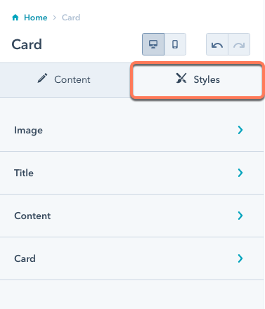
Keep accessibility in mind when deciding between using an image or background image field. If the content creator should have the ability to add alt text, use an image field rather than a background image field.
Organizing fields
How you organize fields plays a significant role in the content creator’s ability to quickly make changes. Below are recommended best practices for organizing fields:- Group style fields based on the component they control rather than the stylistic element.
- Leave only the highest-level, most important fields outside of groups.
- Favor creating a component group over unnested groups. If you ever need to add functionality to your module later, you can’t move your modules to a group later without manually updating all of the instances of the module on pages.
- Order field groups in the order in which the components appear based on the primary language of the majority of the content creators that will be maintaining the site. Example: English is read from left to right, top to bottom. If the users maintaining the site typically read right to left in their language, you should provide it in that order. When in doubt, base this off of the primary language of the content for your site.
Example
Below is an example card module.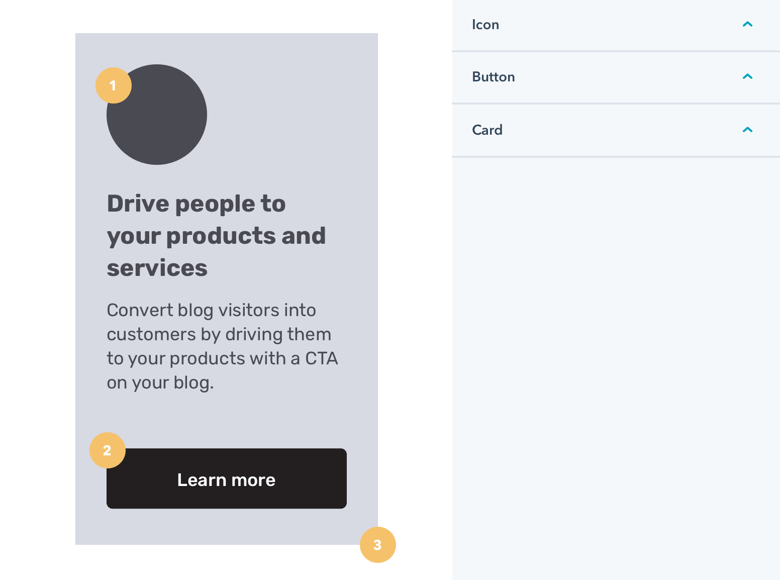
- Icon
- Button
- Card
Required fields
Required fields are fields that the content creator must set in order to display the module and publish the page.- Only require fields to have a value if it breaks the module to not have a value.
- If you need to have a required field, provide a default value if possible.
Typography
Because rich text fields provide more typographical control, it’s recommended to use rich text fields over a combination of text field and font field when possible. There may be cases where you need to be able to provide typographic styles that apply across multiple pieces of content within the same module, such as a text field intended for headers. In that case, you may be able to make the content creator’s work more efficient by providing font and color style fields in the text field. When including rich text fields, it’s recommended to allow the field’s typographic controls to override manually added style fields. If a style field does control a rich text field, it may be worthwhile setting help text, to ensure the content creator is aware.Toggle vs checkbox in boolean fields
When including a boolean field, you can set it to display as either a toggle or a checkbox.- Set the boolean to a toggle when the field controls a major design or layout option. For example, converting the layout of a card from vertical to a horizontal orientation.
- Set the boolean to a checkbox when the change is less drastic. For example, hiding or showing a publish date for a blog post in a featured blog posts module.