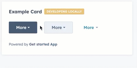
Dropdown component renders a dropdown menu that opens on click, allowing users to select from a compact list of options. Define each dropdown item using <Dropdown.ButtonItem> with optional onClick handlers and overlay definitions for displaying tooltips and opening modals and panels.
Props
<Dropdown> props
| Prop | Type | Description |
|---|---|---|
buttonSize | 'xs' | 'sm' | 'md' (default) | The size of the button. |
buttonText | String | The button text. |
disabled | Boolean | When set to true, the dropdown button cannot be focused or clicked. Set to false by default. |
options | Object | The options included in the dropdown menu. Each option includes:
|
variant | 'primary' (default) | 'secondary' | 'transparent' | The type of dropdown button to display. 'primary' and 'secondary' will display a blue and grey button, respectively, while 'transparent' will display a blue hyperlink. |
<Dropdown.ButtonItem> props
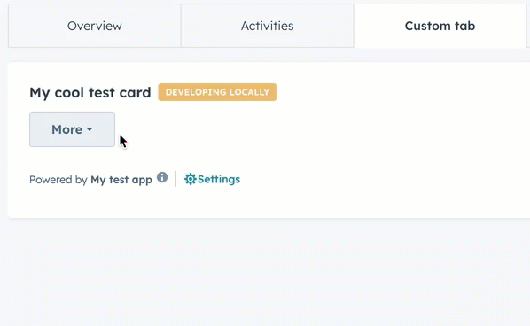
Adding overlays
Similar to the example above, which adds aTooltip overlay to a dropdown item, you can open modals and panels via dropdown items by defining the Modal or Panel within a Dropdown.ButtonItem component’s overlay prop.
Learn more about opening overlays in the UI extension SDK reference.
Variants
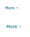
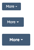
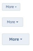
Using thevariant and buttonSize props, you can set the type of button along with its size.
'primary'buttons with size set to'xs','sm', and'md'respectively:
'secondary'buttons with size set to'xs','sm', and'md'respectively:
'transparent'buttons with size set to'sm'and'md'respectively: