The Inline component uses flexbox styling to organize child components in a horizontal row. Similar to Flex and Box, use Inline to manage the layout of a UI extension.
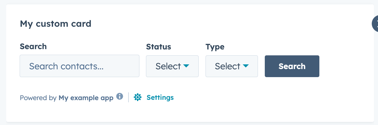
import { Inline, Input, Select, Button, hubspot } from "@hubspot/ui-extensions";

hubspot.extend(() => <Extension />);

function Extension() {
  return (
    <>
      <Inline gap="small" align="end" justify="start">
        <Input label="Search" placeholder="Search contacts..." name="search" />
        <Select
          label="Status"
          options={[
            { label: "All", value: "all" },
            { label: "Active", value: "active" },
            { label: "Inactive", value: "inactive" },
          ]}
          name="status"
        />
        <Select
          label="Type"
          options={[
            { label: "All Types", value: "all" },
            { label: "Leads", value: "leads" },
            { label: "Customers", value: "customers" },
          ]}
          name="type"
        />
        <Button variant="primary">Search</Button>
      </Inline>
    </>
  );
}
Props
| Prop | Type | Description |
|---|
gap | 'flush' (default) | 'extra-small', 'xs' | 'small', 'sm' | 'medium', 'md' | 'large', 'lg' | 'extra-large', 'xl' | The amount of spacing between components. |
justify | 'start' (default) | 'center' | 'end' | 'around' | 'between' | Distributes components along the main axis using the available free space. |
align | 'start' | 'center' | 'end' | 'baseline' | 'stretch' (default) | Distributes components along the cross-axis using the available free space. |
Last modified on December 10, 2025