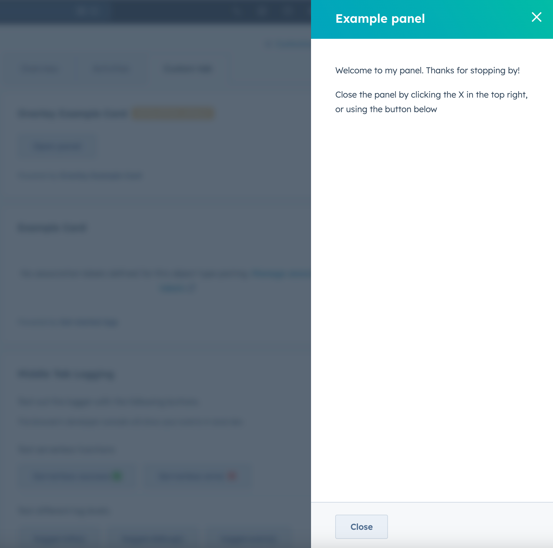
Panel component renders a panel overlay on the right side of the page and contains other components. Like the Modal component, you’ll include the Panel component in an overlay prop within a Button, LoadingButton, Link, Tag, or Image component.
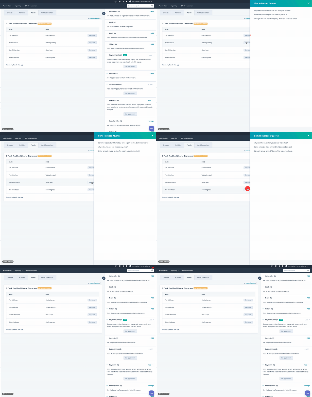
Panel component uses three subcomponents to control its design and content, which follows the general structure below:
<Panel>: the outermost container. It must be a top-level component. You cannot put aPanelinside another component, such asFlex.<PanelBody>: the container that wraps the panel’s content and makes it scrollable. Include only onePanelBodyperPanel.<PanelFooter>: a sticky footer component at the bottom of the panel. Include only onePanelFooterperPanel.
Props
Below are the props available forPanel and PanelSection.
<Panel> props
<PanelSection> props
Opening and closing panels
By default, HubSpot handles opening the panel when the user clicks the parent Button, LoadingButton, Link, Tag, or Image component. A close button will also be included in the top right of the panel.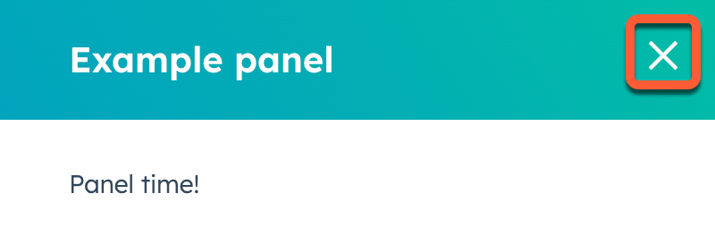
Button, LoadingButton, Link, Tag or Image with an onClick event that triggers the closeOverlay action. To use this action, you’ll need to include the actions argument in hubspot.extend() as seen in the example code below. /apps/developer-platform/add-features/ui-extensions/ui-extensions-sdk#registering-the-extension
Learn more about opening and closing overlays.
Variants
By default, the panel will only obscure the content on the right side of the page where it opens. Using thevariants prop, you can add an additional overlay behind the panel to blur the rest of the page. This variant puts more focus on the panel and improves accessibility for users with screen readers. Because the modal variant obscures the rest of the page’s content, use it only when users don’t need other context from the page.