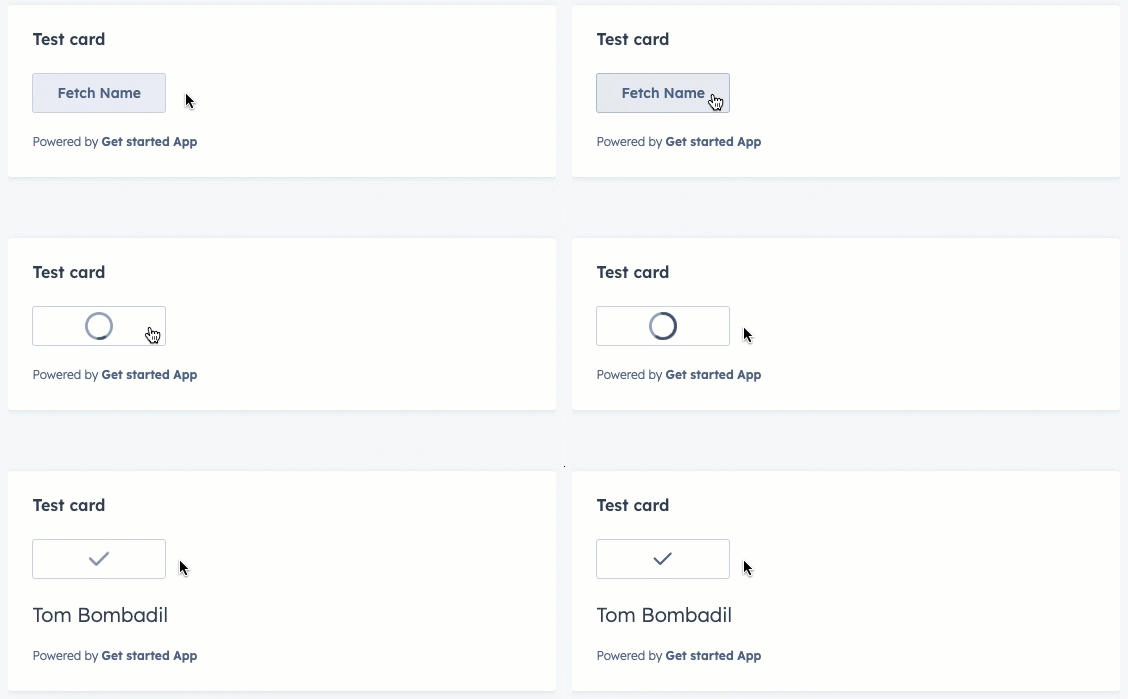
Learn about the LoadingButton component for use in UI extensions.
The LoadingButton component renders a button with loading state options. It includes the same props as the Button component with a few additional props for managing loading state.
Like the Button, Link, Tag, and Image components, the LoadingButton component can open an overlay. In addition, you can use the overlayOptions prop to trigger the overlay either on click or when the loading has finished.
Using the variant prop, you can set the color of the button.
Primary: a dark blue button for the most frequently used or most important action on an extension. Each extension should only have one primary button.
Secondary (default): a grey button to provide alternative or non-primary actions. Each extension should include no more than two secondary buttons.
Destructive: a red button for actions that delete, disconnect, or perform any action that the user can’t undo. Button text should clearly communicate what is being deleted or disconnected. After a destructive button is clicked, the user should have to verify or confirm the action.
Please note:HubSpot does not provide variant options for the orange buttons you’ll find across the app (both solid and outlined). Those color variants are reserved for the HubSpot product, which helps to maintain the hierarchy of available actions on a given page.