-
Default menus: HubSpot provides two default menu types that can be used as needed out of the box. These menus can be added as modules in the page editor in drag and drop areas or in templates, or you can add them to custom modules using HubL tags.
- Menu: commonly used for global navigation, such as in the website header or footer, the default standard menu enables you to select a menu that you’ve configured in your navigation settings, then configure it further with options such as maximum levels, display settings, and orientation.
- Simple menu: commonly used for page-specific navigation, such as pillar pages, the simple menu module enables you to create menus at the page level. Rather than reference a menu that you’ve built in your navigation settings, simple menu items are managed in the content editor and have fewer configuration options than the standard menu. This enables content creators to update menus on specific pages as needed without impacting global navigation.
-
Custom menus: when the default menu options don’t fit your needs, you can create your own custom solutions. This can range from building custom modules that include default menus using the standard menu and simple_menu HubL tags, to using the menu() HubL function to build out a completely custom solution using repeater groups or HubDB. That being said, when building a complicated custom menu, you should keep in mind the editor experience. In many cases, it may make more sense to use the
menuandsimple_menufields in tandem with themenu()function so that there’s a balance between custom solution and intuitive editing experience.
Navigation Settings
In each account, HubSpot includes navigation settings so that you can create multi-level menus to reference in menu modules and tags. This creates a single source of truth for a set of menu items, so you’ll only need to update a menu once to update all pages referencing that menu. You can create as many menus as needed, and each menu comes with options for cloning, deleting, renaming, and displaying revision history. To create and manage menus in HubSpot, navigate to Settings > Website > Navigation menus. Learn more about navigation settings in HubSpot’s Knowledge Base.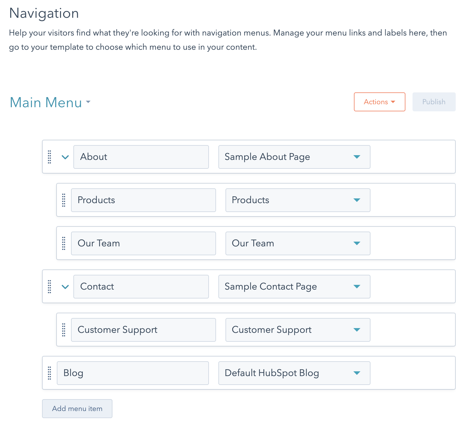
A best practice for site headers, which often contain the lengthy main navigation, is to provide a “skip to content” link. This helps users navigating by keyboard, skipping over lengthy menus.
HubL menu tags
Use themenu and simple_menu HubL tags to add menu functionality to custom modules. Adding the tag to a module will render the menu on the page. To enable content creators to configure the menu’s options in the page editor, you’ll need to include the menu or simple menu field in the module as well.
Below, learn more about each type of menu tag.
Standard menu
The HubL Menu tag generates standard menu HTML with class names already provided for depth levels, active states, and if the item has children. The menu tag can be used within custom modules making it an easy way to create navigation menus for main nav’s and sidebar navigation. This tag expects you to provide the menu ID.Simple menu
The simple menu tag functions just like the menu tag by generating standard menu HTML with class names for depth levels, active states, and if the item has children. The difference is that this tag expects you to provide a dict of the menu structure instead of a menu ID. This is useful for when you want a module’s fields to determine the structure of a menu instead of using the navigation settings. For example, you may want to use this type of module for the table of contents of a pillar page.Default menu modules
HubSpot provides default modules that you can add to coded templates, as well as pages through the page editor when a template includes drag and drop areas. Each module will have a different editing experience, with the standard menu having more configuration options than the simple menu. Because modules cannot be nested, you cannot place these modules inside of other modules. Instead, you should use the menu or simple menu tags.Standard menu markup
Default menu modules are powered by their respective HubL menu tags (menu and simple_menu) to generate standard menu HTML. Like other HubSpot modules, menu modules are wrapped in module wrapper markup. These div and span tags make the module editable with the content editor. The menu markup of both the menu and simple menu modules is the same, with the exception of some of the classes applied to the wrapper and menu containers.
ul wrapped in a div with the hs-menu-wrapper class. This wrapper will have additional classes based on how the module is configured in the page editor, such as enabling flyouts. Learn more about classes added by these settings below.
Within the ul, each menu item is an a tag wrapped in a li. The li tag has a class that indicates the depth of the item in the menu tree (e.g., hs-menu-depth-1). When a menu item contains a nested child item, the corresponding li will have the additional class of hs-item-has-children. The child menu renders as a nested ul with the class hs-menu-children-wrapper.
When you visit a page that is included in your menu tree, the class active-branch is added to the parent li items and a class of active is added to that page’s particular li item.
Standard menu styling
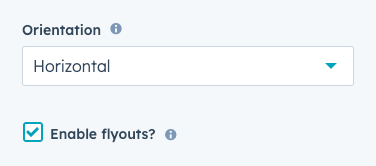
At the module level, whether editing a menu module in the page editor or editing a menu field in a custom module, you’ll have a few configuration options. The Menu, Advanced menu type, and Max levels fields enable you to control the menu items are rendered asli in the page markup. But the orientation and flyouts options will impact the CSS selectors added to the menu wrapper div. You can then target these selectors in your CSS.
div depending on these field settings.
To get you started styling menus, below are some example CSS selectors that can be used to style the menu tag and default menu module.