The Checkbox component renders single checkbox input. If you want to display multiple checkboxes, you should use ToggleGroup instead, as it comes with extra logic for handling multiple checkboxes and radio buttons.
import { Checkbox } from "@hubspot/ui-extensions";
const Extension = () => {
return (
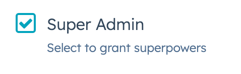
<Checkbox checked={isSuperAdmin} name="adminCheck" description="Select to grant superpowers">
Super Admin
</Checkbox>
);
};
Props
| Prop | Type | Description |
|---|
aria-label | String | The checkbox’s accessibility label. |
checked | Boolean | When set to true, the checkbox is selected. Default is false. |
description | String | Text that describes the field’s purpose. |
initialIsChecked | Boolean | When set to true, the checkbox is selected by default. Default is false. |
inline | Boolean | When set to true, arranges checkboxes side by side. Default is false. |
name | String | The checkbox’s unique identifier. |
onChange | (checked: boolean, value: string) => void | A callback function that is called when the checkbox is selected or cleared. Passes the new value. |
readOnly | Boolean | When set to true, the checkbox cannot be selected. |
value | String | The checkbox value. This value is not displayed on the card, but is passed on the server side when submitted, along with the checkbox name. |
variant | 'sm', 'small' | 'default' | The size of the checkbox |
Last modified on January 9, 2026