The RadioButton component renders a radio select button. If you want to include more than two radio buttons, or are building a form, it’s recommended to use the ToggleGroup component instead.
import { RadioButton } from "@hubspot/ui-extensions";
function Extension() {
const [roleType, setRoleType] = useState("support");
return (
<>
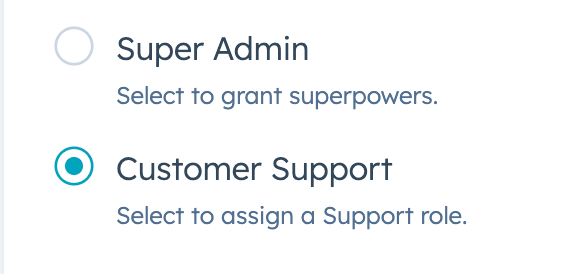
<RadioButton
checked={roleType === "superAdmin"}
name="roleType"
description="Select to grant superpowers."
onChange={() => {
setRoleType("superAdmin");
}}
>
Super Admin
</RadioButton>
<RadioButton
checked={roleType === "support"}
name="roleType"
description="Select to assign a Support role."
onChange={() => {
setRoleType("support");
}}
>
Customer Support
</RadioButton>
</>
);
}
Props
| Prop | Type | Description |
|---|
checked | Boolean | Whether the radio button is currently selected. Default is false. |
description | String | Text that describes the field’s purpose. |
initialIsChecked | Boolean | When set to true, the option will be selected by default. Default is false. |
inline | Boolean | When set to true, arranges radio buttons side by side. Default is false. |
name | String | The input’s unique identifier. |
onChange | (checked: boolean, value: string) => void | A callback function that is invoked when the radio button is selected. Passes the new value. |
readonly | Boolean | When set to true, users will not be able to enter a value into the field. Set to false by default. |
value | String | number | The radio button value. This value is not displayed, but is passed on the server side when submitted, along with name. |
variant | 'sm', 'small' | 'default' (default) | The size of the checkbox. |
Last modified on January 9, 2026