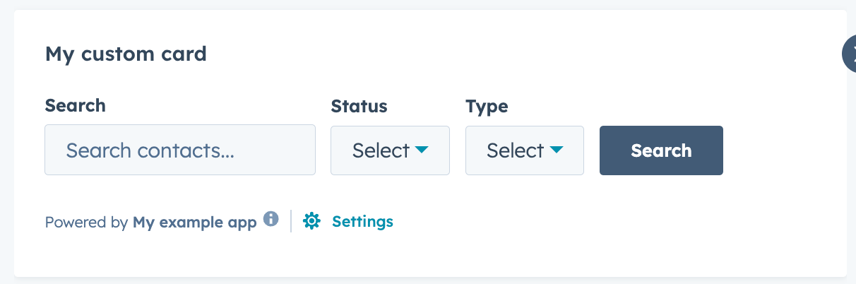
width prop for images. But HubSpot also provides the following set of components for further configuring your extension’s layout:
These components are based on CSS flexbox layout, and act as wrappers for other components. For full examples of using Flex and Box, check out HubSpot’s Managing layout: Flex and Box sample project.
AutoGrid

TheAutoGrid component arranges components into columns based on available space and specified column width restraints. Includes two modes: fixed column sizing (default), and flexible column sizing. For both modes, the layout will be responsive automatically, whether you’re using it in an app card, app home page, or app settings page.
Flex
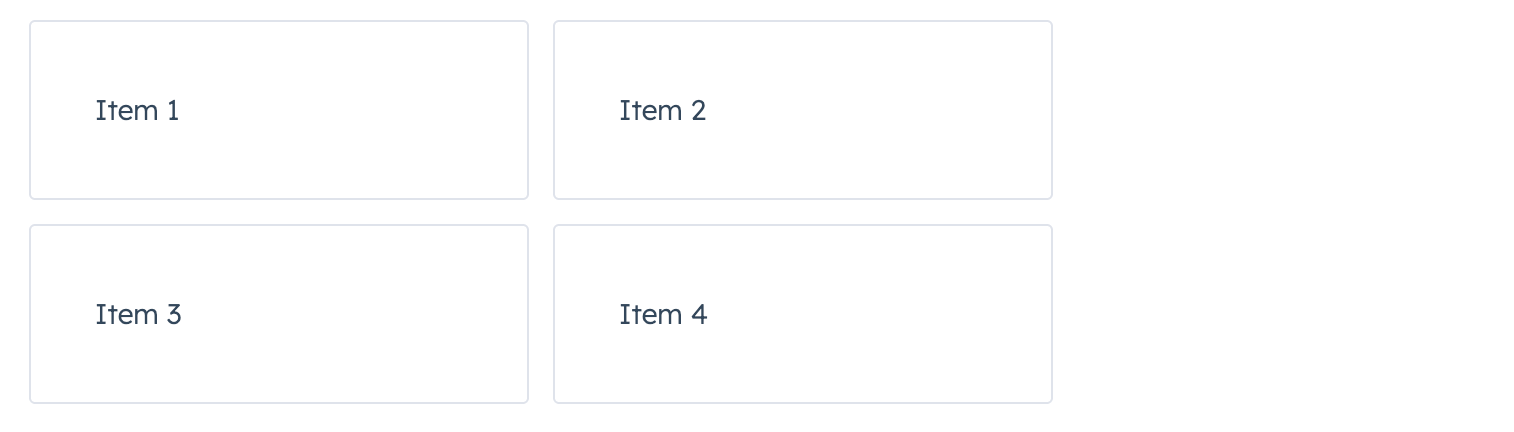
TheFlex component renders an empty div container set to display=flex. When wrapped around other components, this enables those child components to be arranged using props.
Below are the available Flex props. To review all Flex prop definitions, check out the components reference guide.
Review the examples below to see how the Flex component can be used to arrange components in various ways.
Horizontal layout
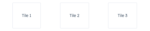
To arrange components horizontally, setdirection to row. Then, use justify to configure the horizontal distribution. By default, components will stretch across the container if justify is not specified.
To arrange components horizontally and evenly spaced:



Wrap
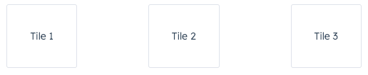
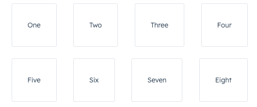
By default, components in arow will be arranged on one line when possible. Use the wrap prop to wrap components onto new lines when needed.
Vertical layout
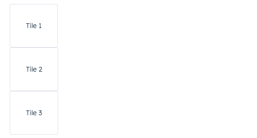
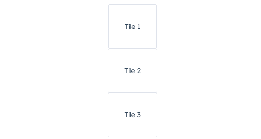
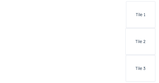
To arrange components vertically, set direction tocolumn, then use the align prop to distribute them. By default, components will stretch across the extension container width when align is not specified.
To arrange components vertically at the start of the extension container:
Spacing
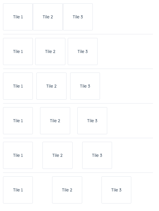
In theFlex component, you can use the gap prop to apply even spacing between the tiles. This prop will apply spacing equally for both row and column directions.
Using Flex in Flex
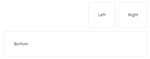
You can wrap childFlex components with Flex to set more specific rules for individual components. A child Flex component will not inherit props specified in the parent Flex component, so you’ll need to repeat any props you’ve previously defined to maintain them.
Box
When wrapping components withFlex, you can further configure individual component layout by wrapping a child of Flex in a Box component.
This component supports the following props. To review all Box prop definitions, check out the components reference guide.
Use the
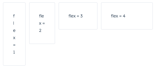
flex prop in a Box component to assign any extra spacing to components using either a default value (e.g. auto) or a specific number. When using a number, the components will be distributed based on the ratio of their assigned numbers.
For example, the four tiles below take up an increasing amount of space based on their flex values.
Box, you only need to wrap components that you want to adjust. For example, if you wrap one component in a Box with a flex value, only that one component will have its width adjusted based on the available empty space.
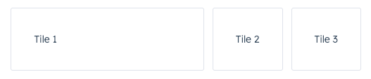
When setting a
flex value for only one Box, you can use any number. This is because any number on its own will result in all available space being assigned to that one component.alignSelf prop to override alignment rules for individual Box components.
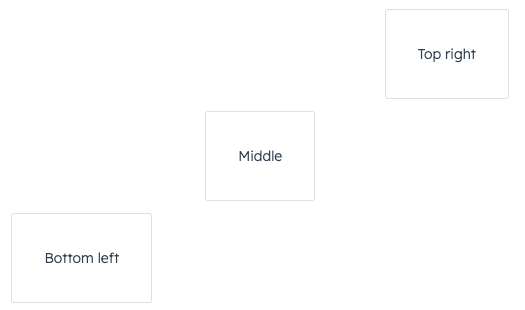
Inline
Use theInline component to organize child components into a horizontal row.