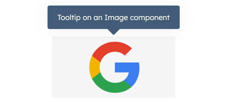
Tooltip component renders a tooltip when hovering over other UI components to provide users with additional context. This component can be inserted via the overlay prop in Button, Image, Link, LoadingButton, and Tag components.

Props
Placement
Using theplacement prop, you can set where the tooltip will appear relative to the parent UI component (default is top). Below is an example of each placement value.